MOOD BOARDS
Through the creation of mood boards, the graduate student conducted a visual analysis of four different infographic styles. Through the observation of these selected mood boards, the graduate student will determine the aesthetic direction of the application.

NAME IDEATION
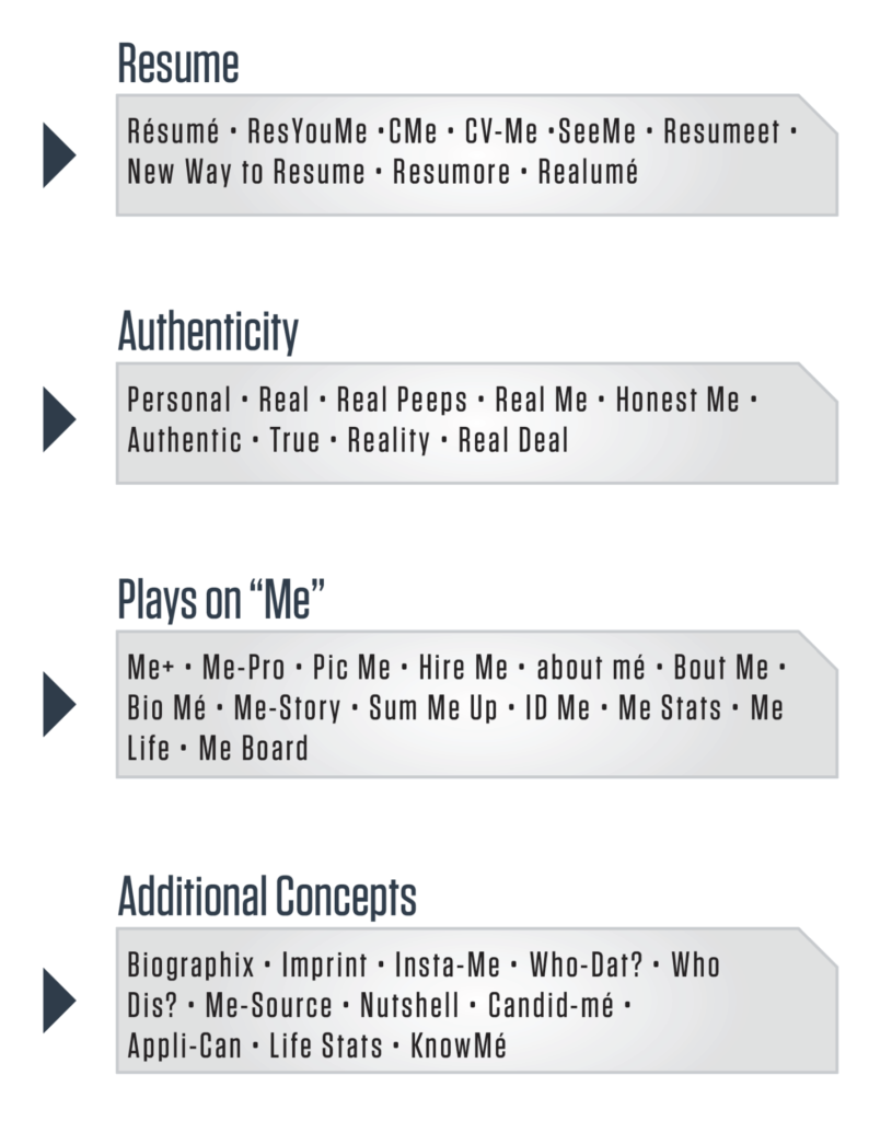
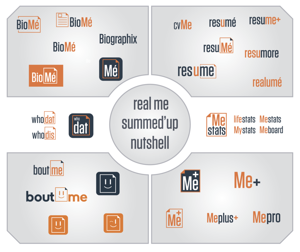
In order to create a name that captures both the professional nature of the traditional resume and the personal nature of a unique personality the graduate student generated a word list comprised of real and invented phrases. The list was created from research as well as stream-of-consciousness hybridization of terms. The purpose of the ideation was to find a combination of known terms that could be combined to quickly communicate the intentions of the application.
COLOR EXPLORATION
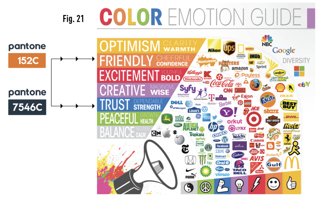
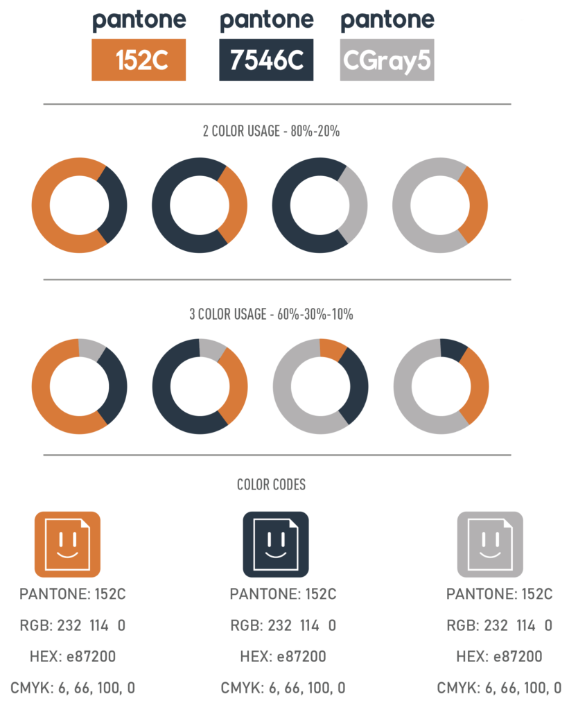
Through research and exploration of basic color theory, along with current industry standards, the graduate student selected an appropriate color palette to project professionalism and excitement. As noted in fig. 20, the dominant color for social media applications tends to exist within the blue color spectrum. This falls in line with the claim made in fig. 21 that blue is perceived to project a sentiment of “trust, dependability, and strength”(Color-Graph.png). The graduate student selected Pantone® 7546C, a deep, rich, sophisticated blue, to separate it from the pack of blue social media applications while still living in the color family.

The second color selected is Pantone® 152C, a warm and vibrate orange. This color was selected for is high contrast to Pantone® 7546C and it complimentary nature. In addition to the chromatic relationship between the two colors, 152C, as noted in fig 21, is associated with, “Friendly, Cheerful, and Confidence” (Color-Graph.png). This color represents the personal side of the application. The color selections are visually contrasting, yet complementary and purposely embody the emotional spirit of the application that gives balance to both the professional and personal spirit of an individual.
LOGO THUMBNAILS
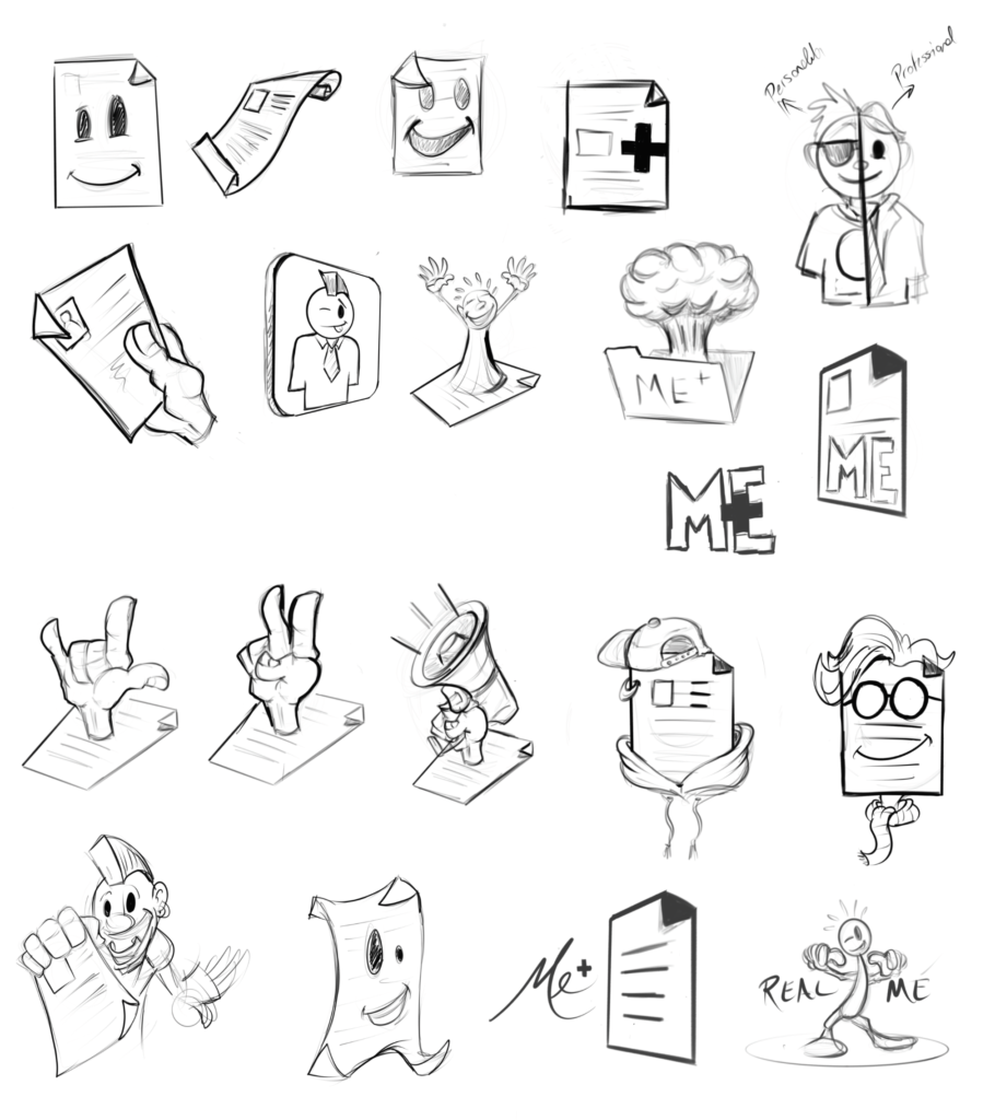
Through the sketching of twenty thumbnails, the graduate student explored the merging of personality and the traditional resume. The rough illustrations sought to combine the quirky and sometimes wild human characteristics with the bulleted list most commonly associated with the traditional paper resume.
LOGO CREATION MIND MAP
Utilizing the content from the name ideation, color selections, and thumbnail sketches the graduate student created a visual mind map to explore visual concepts of how all the design elements could work together effectively communicate the intended function of the application on both an intellectual and emotional level.
BRAND GUIDE
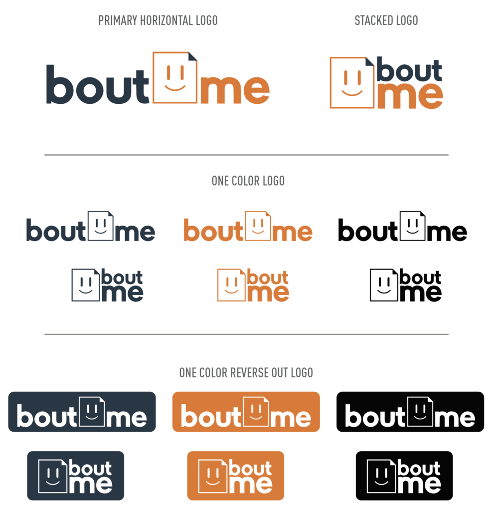
The Bout Me brand strives to present the working professional in a real, honest and holistic manner by placing as much emphasis on an individual’s personality as their abilities and work experience. After all, you are more than a bulleted list.
ICONS
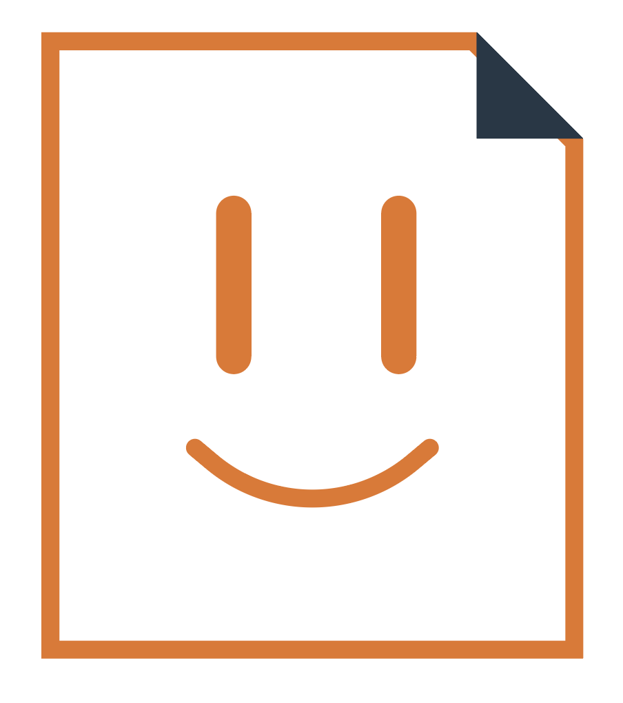
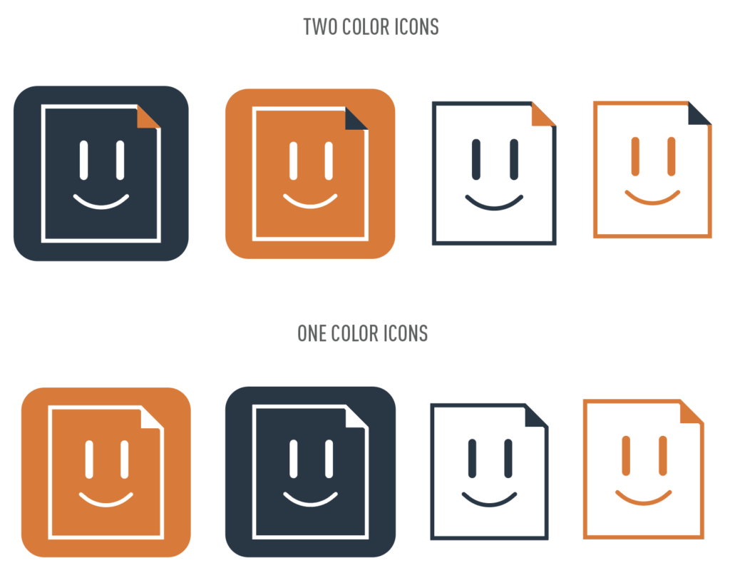
Meet Rezzy, the Bout Me icon. Rezzy’s hard edges reflect his strong devotion to excellence and hard work. His only bent edge, or “earmark”, is a badge of experience that marks him as a top candidate in any field. Inside the professional boarder, we see Rezzy’s face composed of soft, rounded shapes. This is where we see Rezzy’s personality shine through. He is full of optimism, energy, and kindness. Rezzy is the perfect blend of skills and heart that employers everywhere need.
COLOR PALETTE
FONT FAMILY
INTERFACE DESIGN
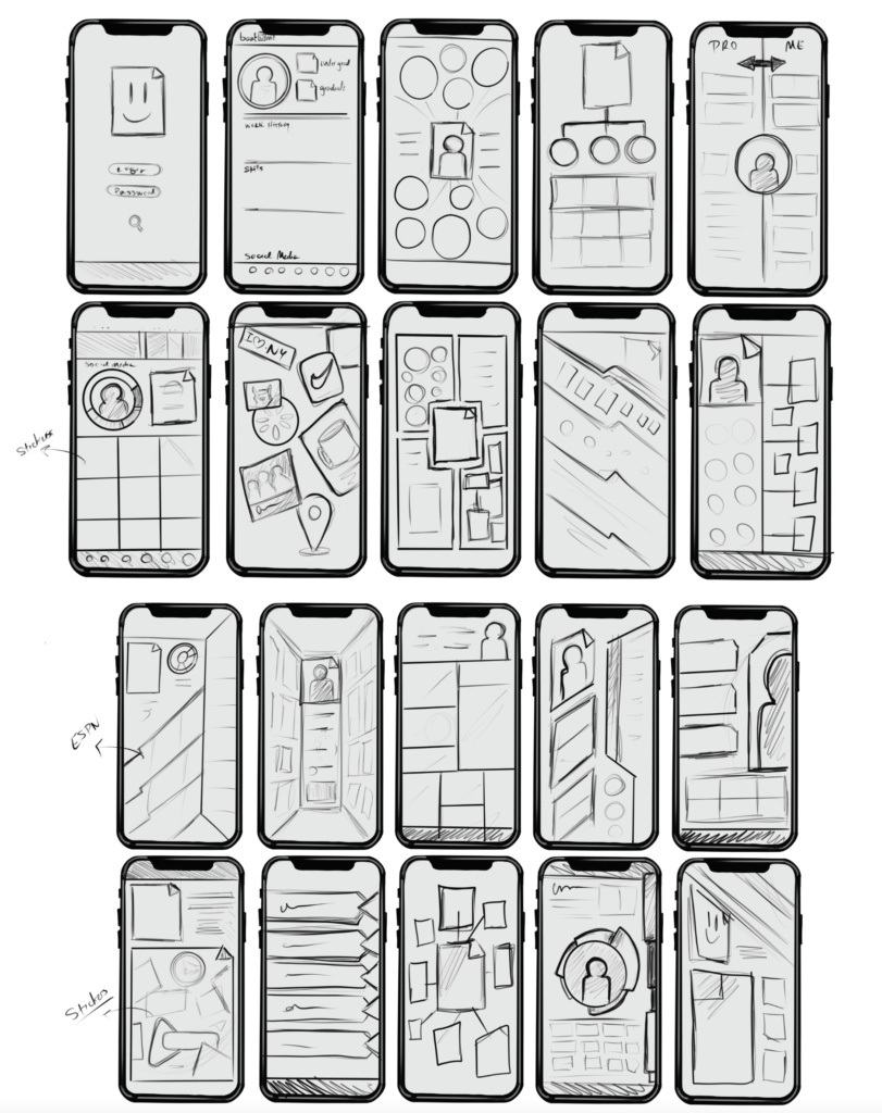
The process of designing the interface and functionality was done simultaneously as the form and function live together in a symbiotic relationship. The general aesthetic for the interface was built upon the brand guide. However, it was important to note that the interface needed to be subdued in regard to the personal brand of the applicant. The function was designed to be as simple as possible in order to make the experience enjoyable and useful for both the applicant and the employer. I sketched a series of thumbnails to determine how the general aesthetic could work with the functionality in generating a snapshot of in individual’s professional and personal profile. The goal was to work through how the information could be presented to tell the story of who the applicant is in a clear and concise manner.
BASIC FLOW CHART
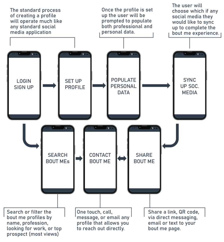
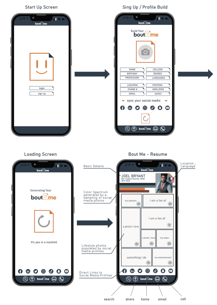
Before I worked through the details I laid out a basic flow chart for the user experience. In its most basic form, the application was laid out to operate similarly to any other social media platform. The user must first create a profile to begin the process of generating a Bout Me. In the process of setting up the profile, the user will manually enter basic data such as their name, profession, and education information. This data outlines the searchable information regarding their profession. They will also be asked to populate the personality mood board portion as well with general prompts. The function of syncing up their social media will allow potential employers to navigate directly to the selected social media site of the applicant.
GENERAL AESTHETIC AND FUNCTION
I developed the general aesthetic to be very minimal and clean so as to not overshadow the brand and personality of the individual. The first step as with many applications is to develop the user profile. This is particularly important as the primary purpose of the application is to showcase an individual. The simplicity of use and communication is paramount for this application. It should only take minutes to set up and be ready to use. On the profile page, there are only a few sections that must be populated manually. The remaining data and content already exist through the user’s social media online presence. The hard work is done by the algorithms that source the content from the user’s selected social media platforms to populate the visual resume page. The photos, icons, and videos are pulled from the most recent social media posts by the user. In addition, the algorithm will generate a color pallet from the imagery shown in the user’s choice of posted photography. The entire experience was designed to project a candidate’s personality through their online brand being generated by their social media posts.
THE APPLICANT EXPERIENCE
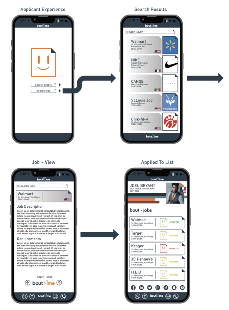
Following the general aesthetic and setup experience I designed the experience for the job seeker. This experience leans heavily on finding employment. Through basic keyword searches such as “Jobs near me”, or “Jobs at” the applicant would be able to see all the available jobs posted on the application. The search results page is designed with large company icons and basic information. Once the user clicks on the desired job posting, they are taken to the job details. It is from this page that the applicant can apply by sending their Bout Me with one touch. The user will then be taken to a bout-jobs page that lists all the jobs to which the user has applied. The jobs are notated in a green happy resume icon for accepted, yellow for pending and a red sad face for rejected. These status updates are generated from the employer’s page as they choose to accept or reject each applicant for a given job.
THE EMPLOYER EXPERIENCE
The employer experience is quite similar in the functionality except in lieu of viewing job postings they are searching for professionals. Through the search bar, the employer can search for job titles, specific degrees, skill sets, or even specific people by name. The results page is populated with a list of matching candidates that can be scrolled through. By selecting a candidate the user can then view their visual resume or bout me page. By clicking the “+” next to the profile photo the candidate is added to a cue of potential applicants. The user can then simply tap the candidate to accept, or reject and untapped candidates will remain yellow marking them as pending. The accepted candidates will see that they have been accepted and either party can reach out to set up an interview.
